I’ll be the first to attest that there is a lot going on under the hood of RelativityOne. As a Relativity Master, I’ve memorized every tab and pull-down option and know exactly where to go to use the program to its full potential. I have all the bells and whistles turned on and because I live and breathe Relativity every day. That being said, I sympathize with new users who can sometimes feel overwhelmed by the complexity of the program.
On August 29th, Relativity will be releasing its next-generation user interface, Aero UI, in Canada, Brazil and Hong Kong. This update will transform how our community interacts with RelativityOne, offering a solution that is easy to use and capable of solving both complex business challenges and small matters.
Last week, we partnered with Relativity to share a sneak peak of what’s to come. During the live session, co-presented by Kyle Disterheft, Group Product Manager at Relativity, we showed side-by-side comparisons of the improvements between the classic interface and Aero UI. In case you missed it, I encourage you to take advantage of the free video recording.
Today, I'm sharing how the new Aero UI interface will change the way you experience, navigate and work in RelativityOne.
How You Experience RelativityOne
Colour scheme
In Classic UI, Aero UI’s predecessor, there is a lot of nuance in how things are coloured and styled, making it a challenge to learn. For example, the colour blue is used everywhere and doesn’t help users navigate the menus and icons. In contrast, Aero UI uses colours purposefully. Dark blue illustrates clickable buttons while orange acts as a way-finder to help you navigate through your dashboard.
Spacing
Classic UI is tightly packed with tons of menus and icons on the main screen. Until you get the hang of the program, you have to hover over each one to understand its functionality. In Aero UI, everything is more spacious. Relativity tucked away a lot of the advanced settings, making the interface cleaner and more approachable. Another perk? Even the font has been optimized for the web, making it easier to read.
How You Navigate RelativityOne
Classic UI has a lot of tabs! This means a long learning curve to understand exactly how the workflows function. Admittedly, the interface was designed to suit experts which can make it intimidating for those who are new to the program.
Now, Relativity has taken a different approach. Its new sidebar in Aero UI allows users to create simple and curated experiences so you can access your workflows whenever you need to. Simply put, there’s no more hunting. If you hit the hamburger icon (☰) in the bottom-left corner of the screen, you will open the “All Tabs Menu” which lists everything out alphabetically. This feature acts as a site map, making it easy to find specific tabs and even discover new ones you may have not known about.
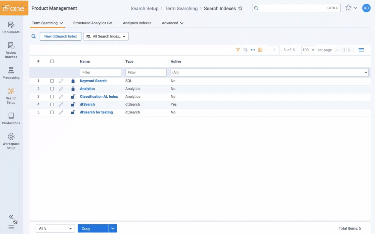
Lastly, Aero UI clearly tracks where you are in the program across the header of the dashboard (i.e., Search Setup > Term Searching > Search Indexes). You can "favourite" these locations to save both time and effort.
How You Work in RelativityOne
Reviewing documents
If you’re a user of Classic UI, you are likely familiar with the 25 MB limitation. While the original viewer is fast, up until this point, we’ve been unable to preview big documents. To do so, you're directed to the text to see what’s in the file, resulting in a sometimes-jumbled format. Plus, there are a lot of advanced options that can be overwhelming.
The limits have been raised for document type restrictions with Aero UI. The new interface allows you to click on a document, email or attachment and instantly see its preview, along with each pages’ content and redactions at a glance.
Relativity has improved the layout by moving the document list to the side, but you can easily adjust it to wherever you like best or pop it out on a separate monitor to toggle between documents. It’s also easier than ever to navigate family groups and document history through the pop-up tabs at the bottom of the viewer. Lastly, the coding is now much more obvious, intuitive and approachable. No more squinting to figure out with each click!
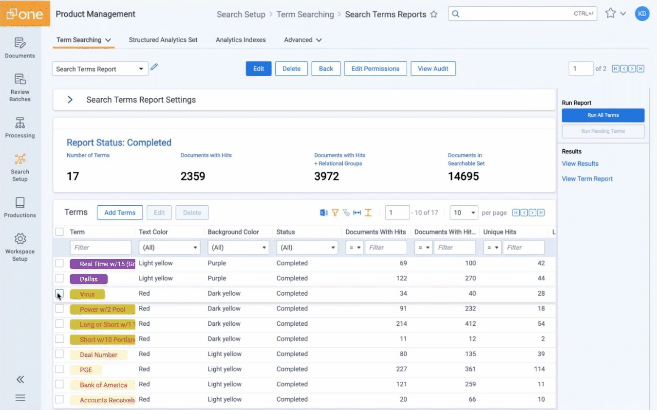
Searching terms
Classic UI requires users to delete and re-add search terms anytime a modification was needed. In Aero UI, you can easily revise the name of any term without impacting your saved searches for those terms.
These improvements are just the beginning of what’s to come. Be sure to view the webinar recording to see the full experience of how it’s changed. We are eager to share the new functions of Aero UI with RelativityOne clients this August.
Whether it’s litigation, information governance, a government request or an internal investigation, RelativityOne by Ricoh gives you the tools you need to tackle any challenge — big or small.

- Affordable, agile and customizable deployment options— scale up and down depending on your needs.
- Ability to manage your own data, users, and processing as required.
- Full customized support by the largest, most certified industry-leading team in Canada.
- RelativityOne enhancements including contract analysis, compliance, review services and more.